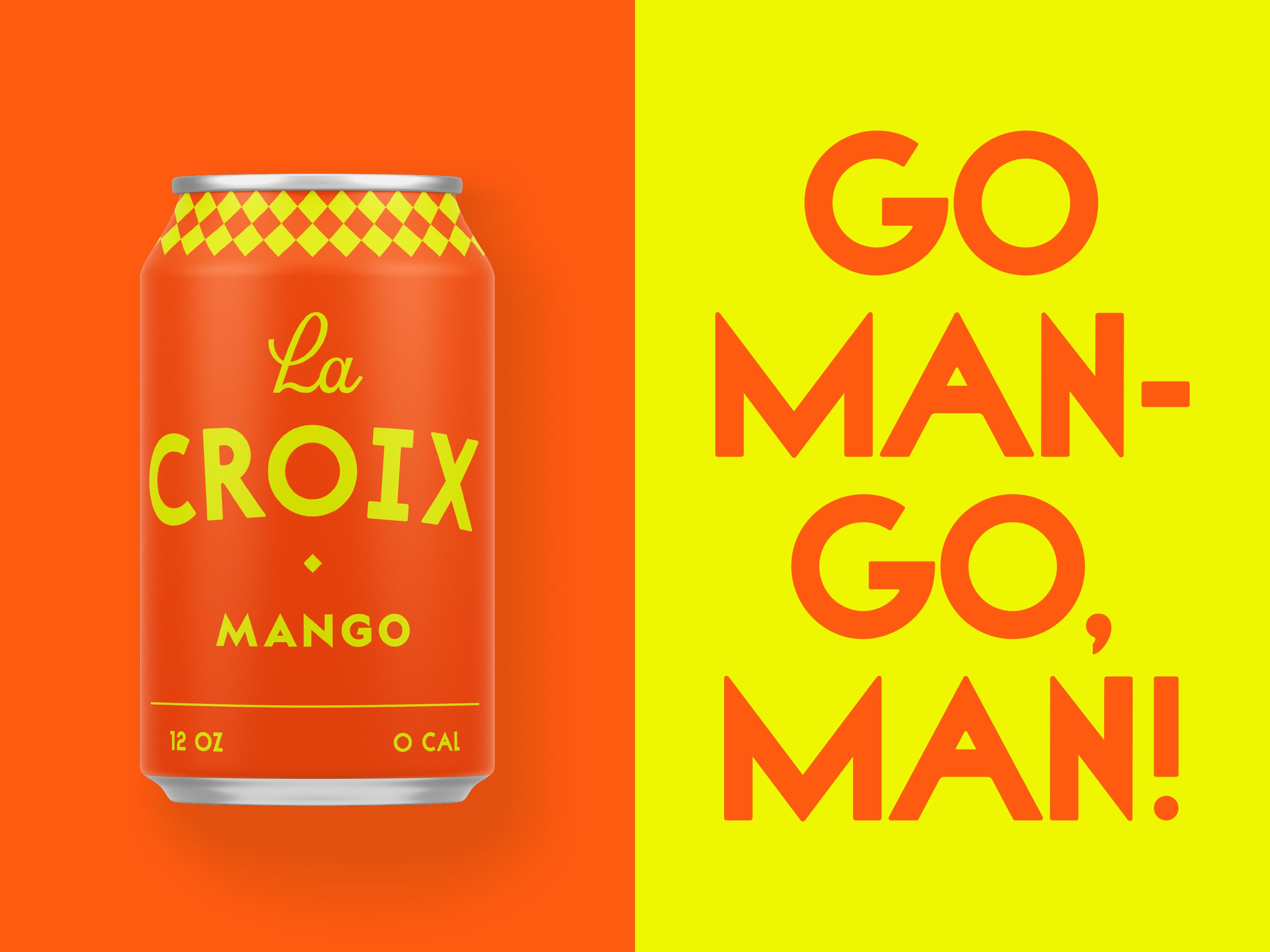
La Croix
What
Brand Identity
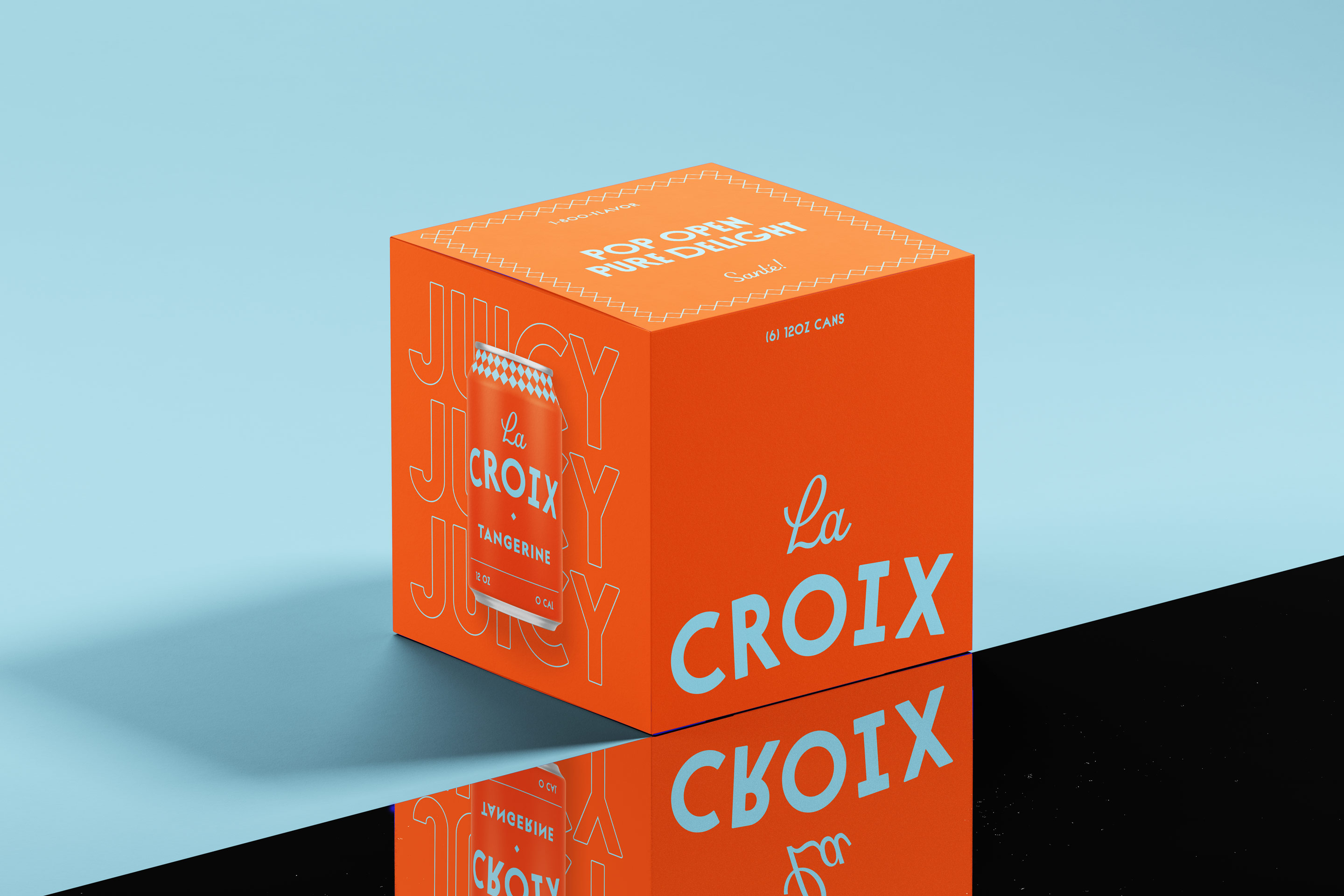
Packaging
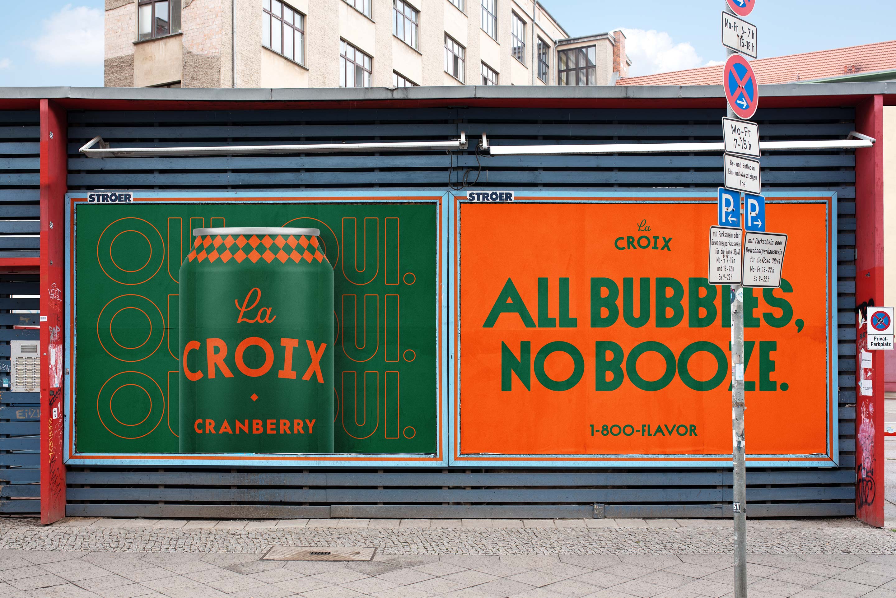
Campaign
Client
La Croix (concept)
Year
2022
Team
Noah Mooney
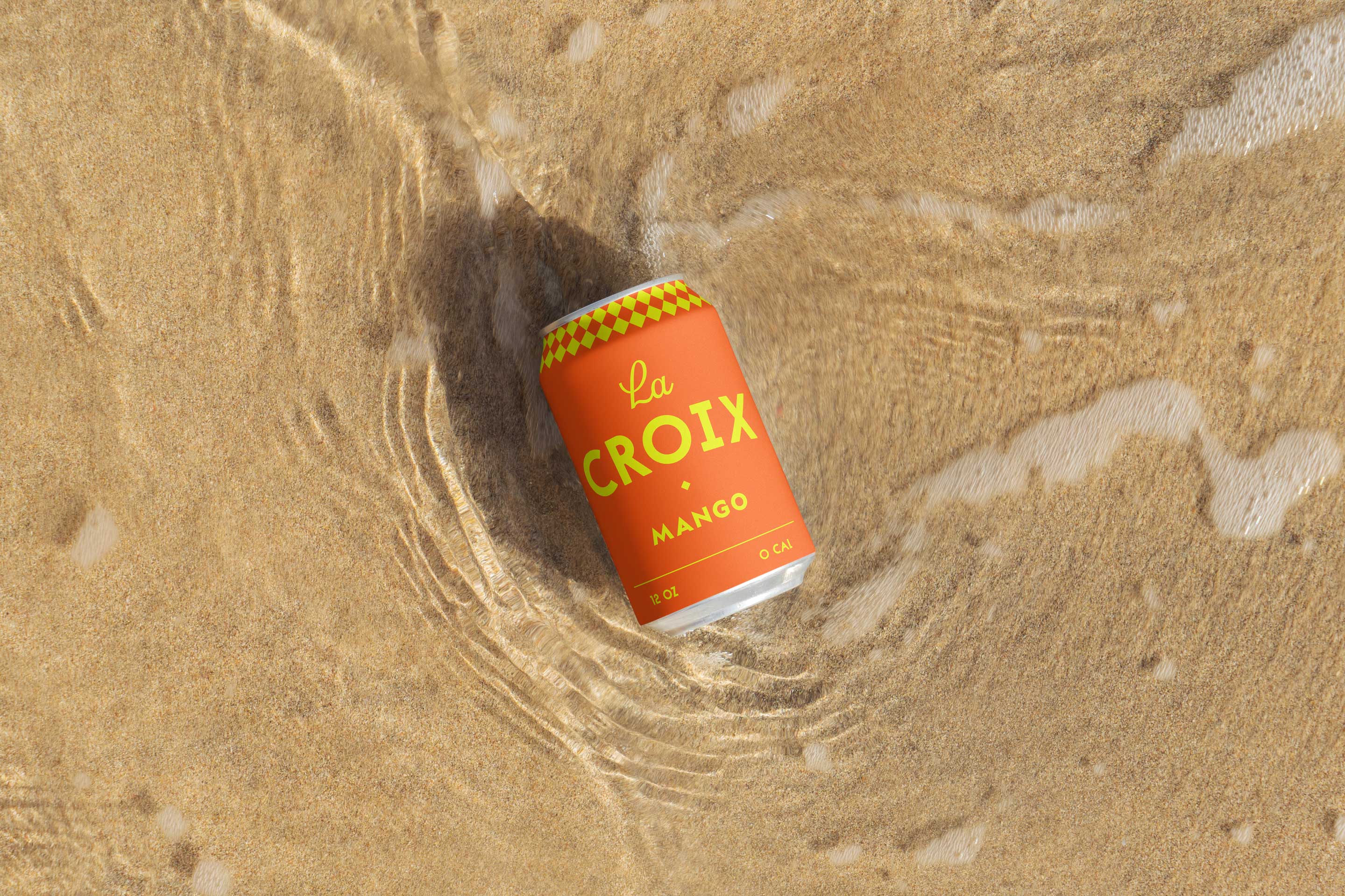
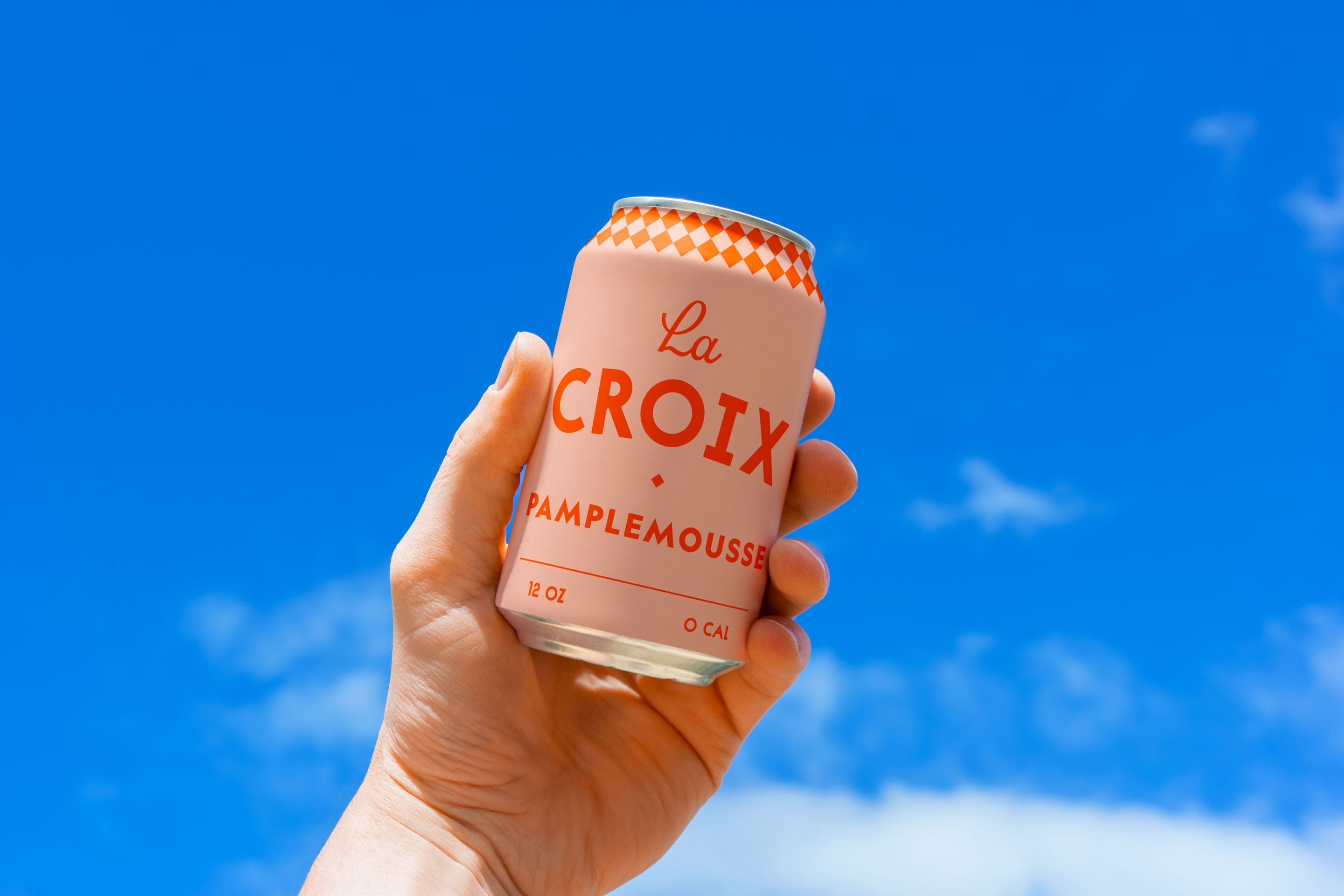
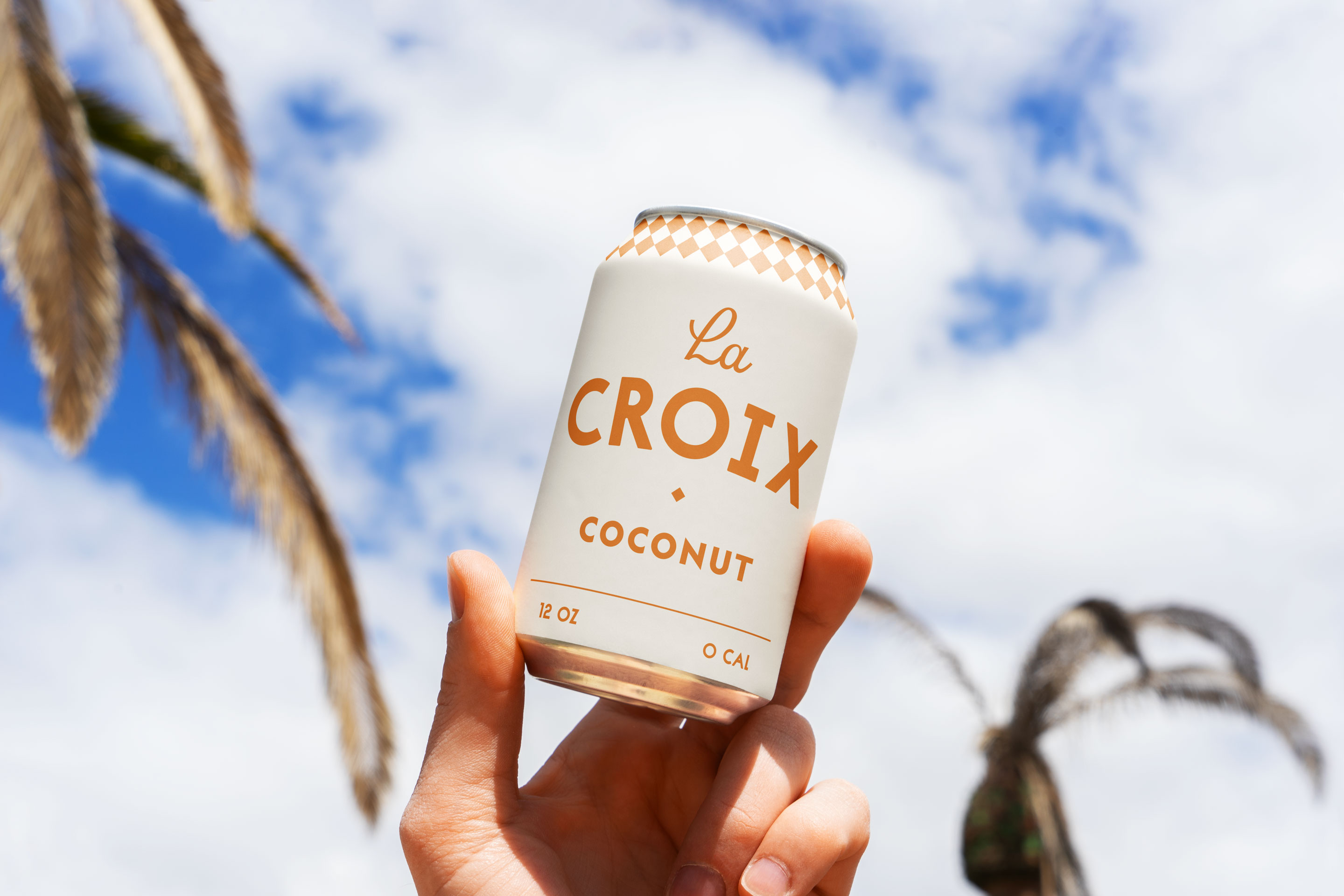
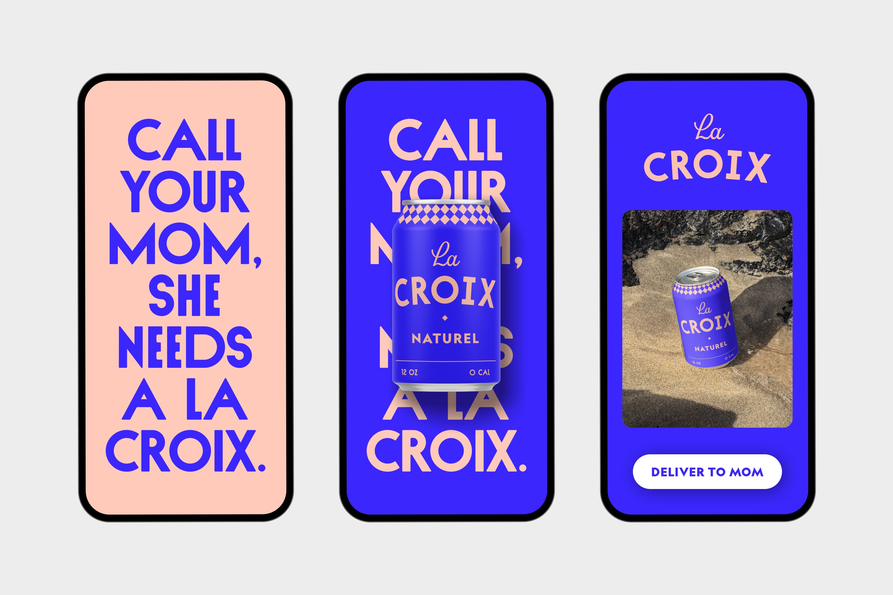
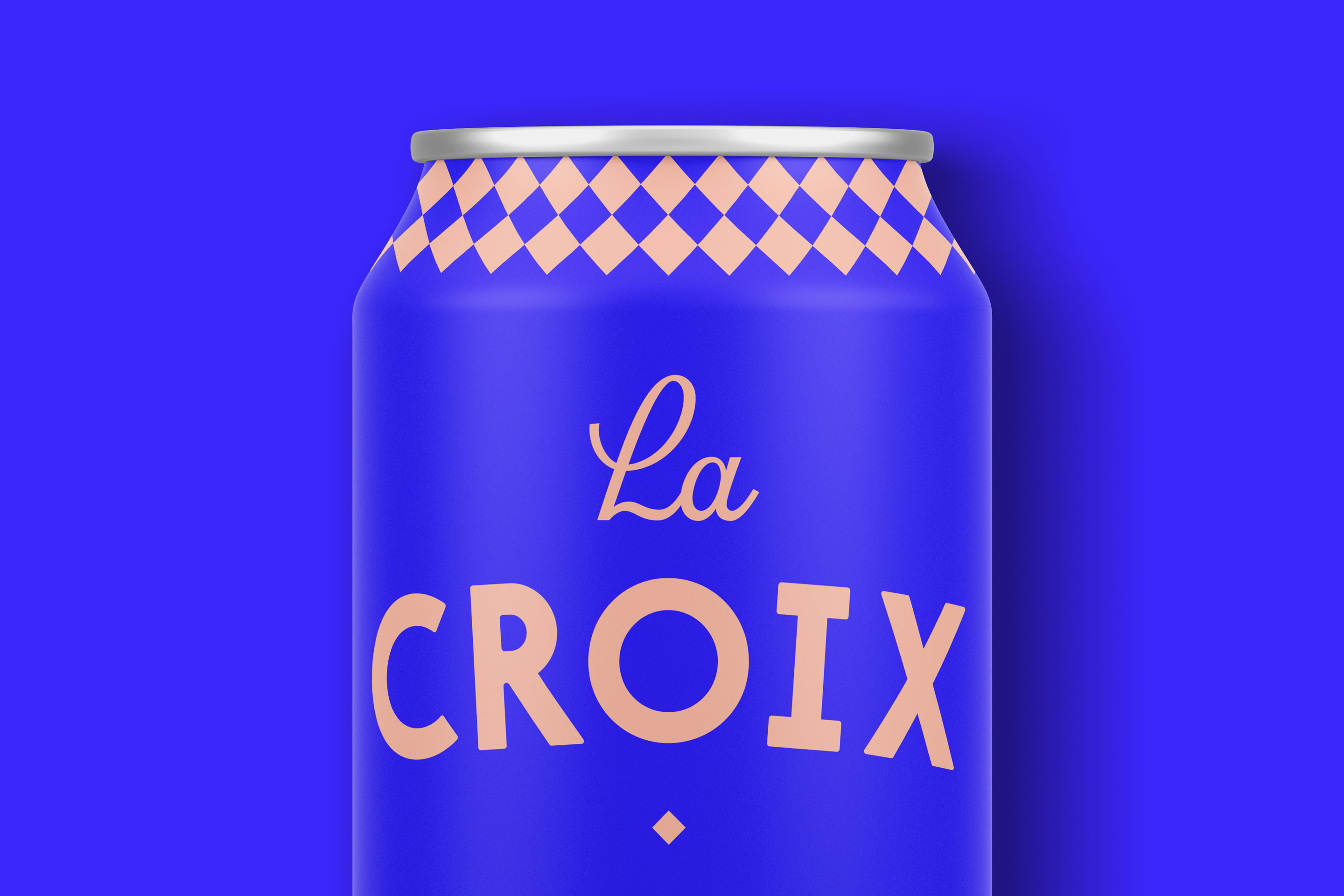
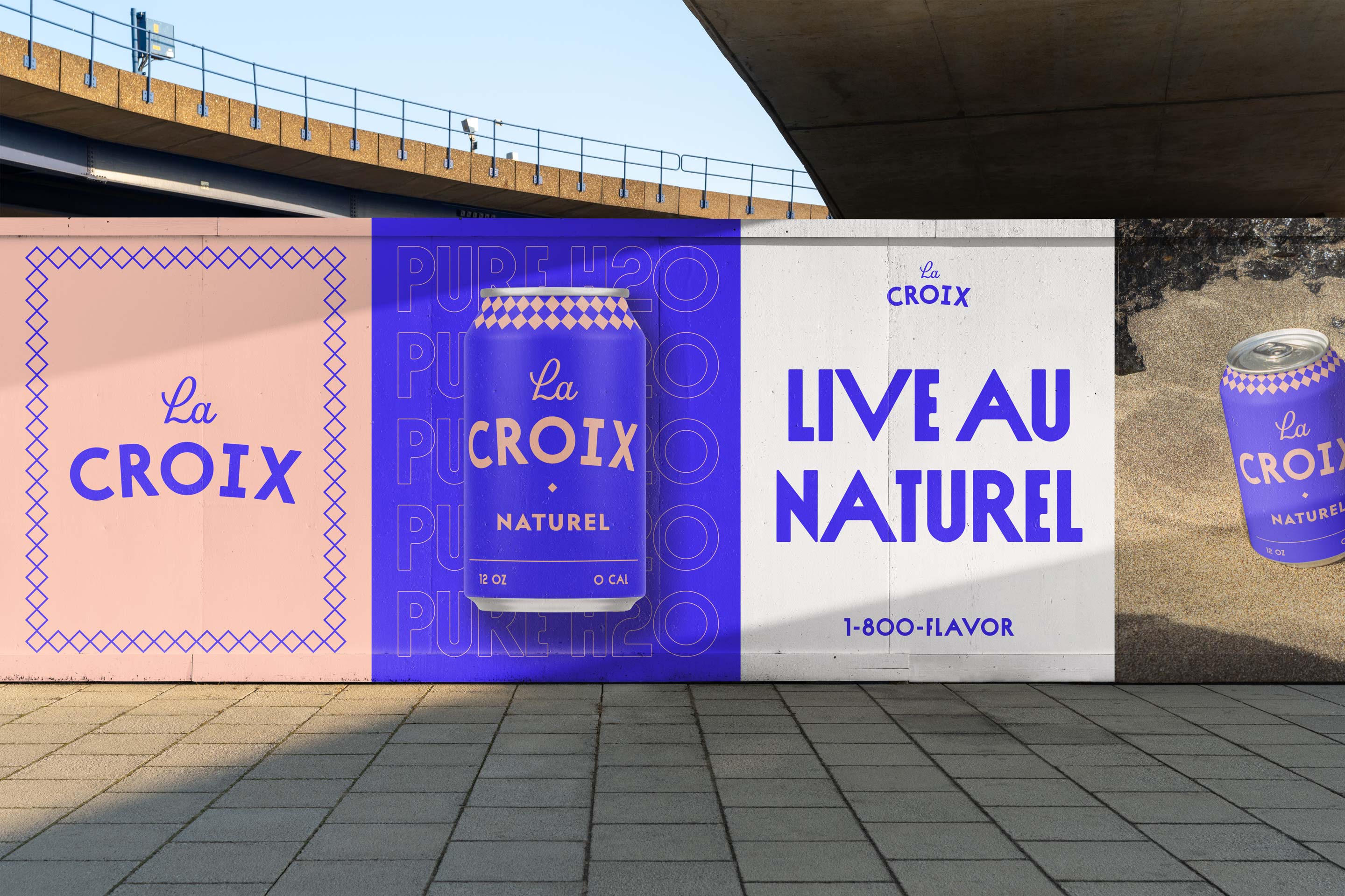
La Croix is the leader in natural-flavored seltzer waters. It's also a U.S.-based company with a very French name. I wanted to explore the idea of redefining La Croix as an international brand with visual roots rich in French history and design. The concept boils down to this: if I were drinking sparkling water in an open-air cafe in the French Riviera, what would the can look like?
This project is a concept and is not affiliated with the La Croix company in any way.
Inspiring a look
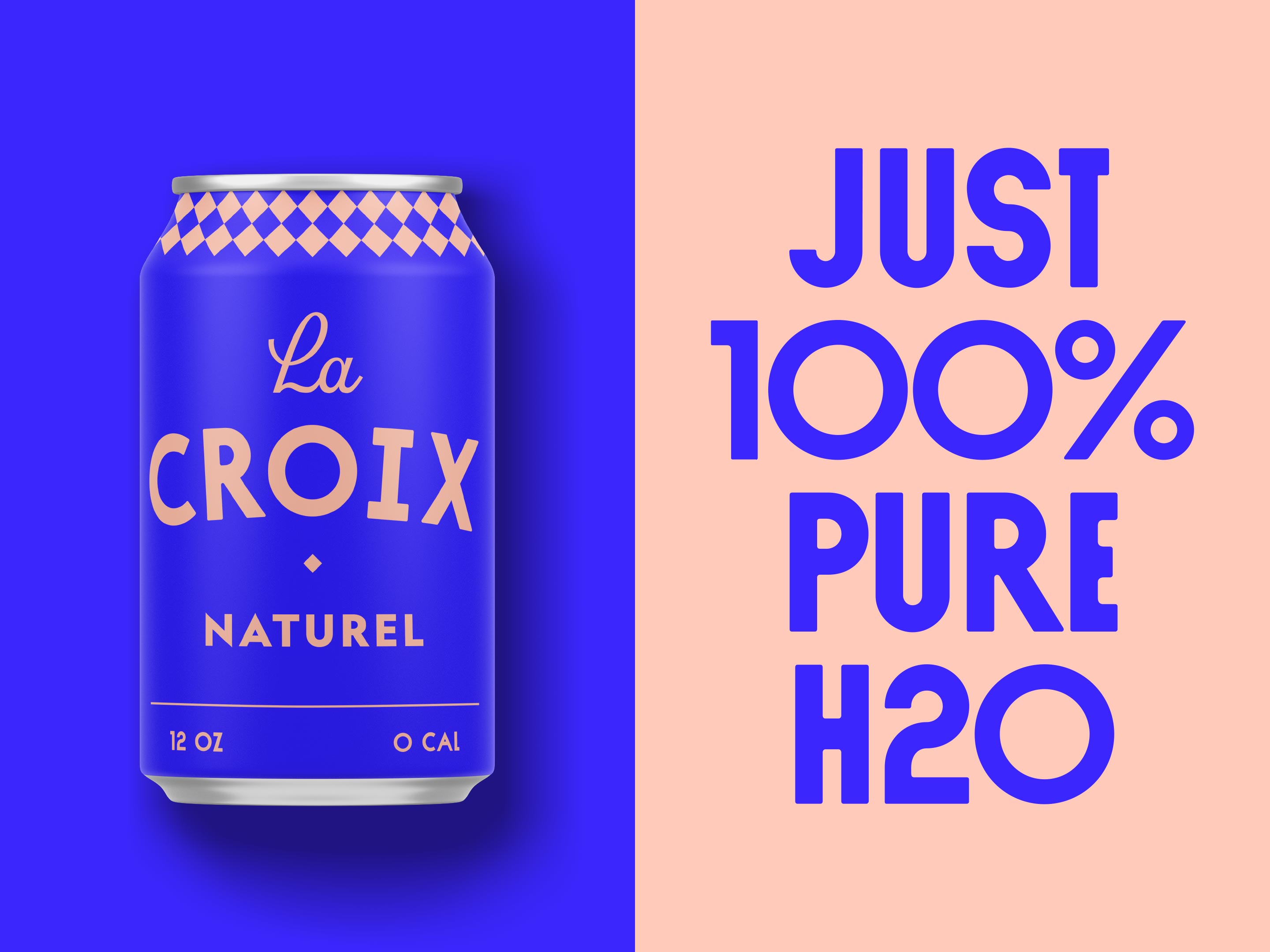
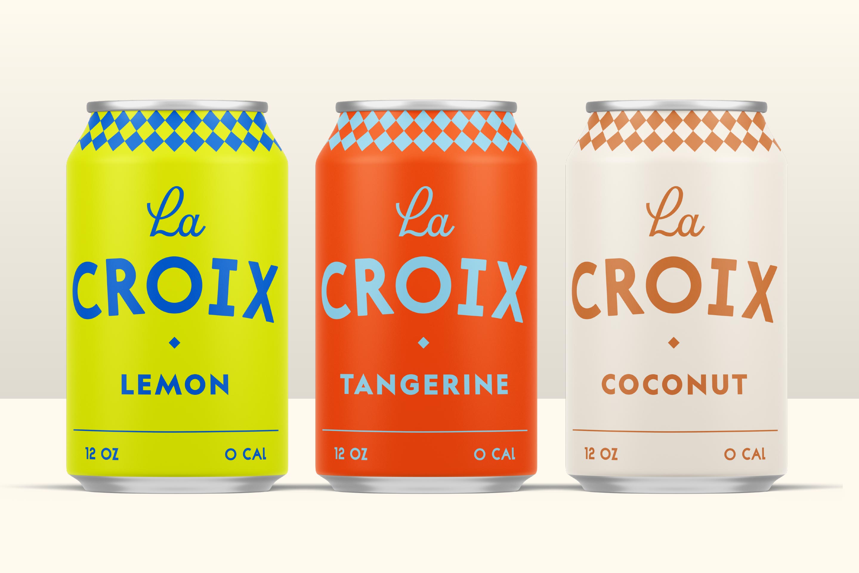
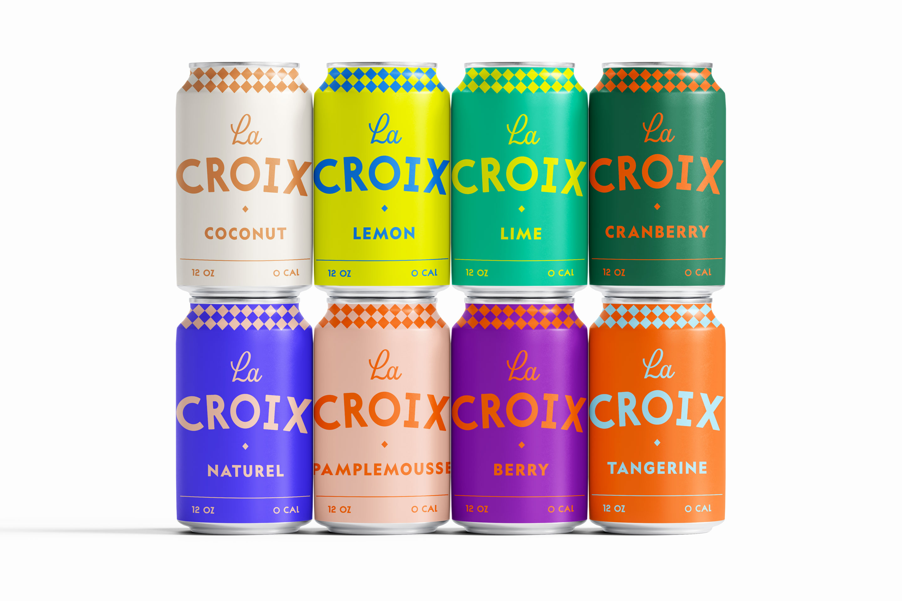
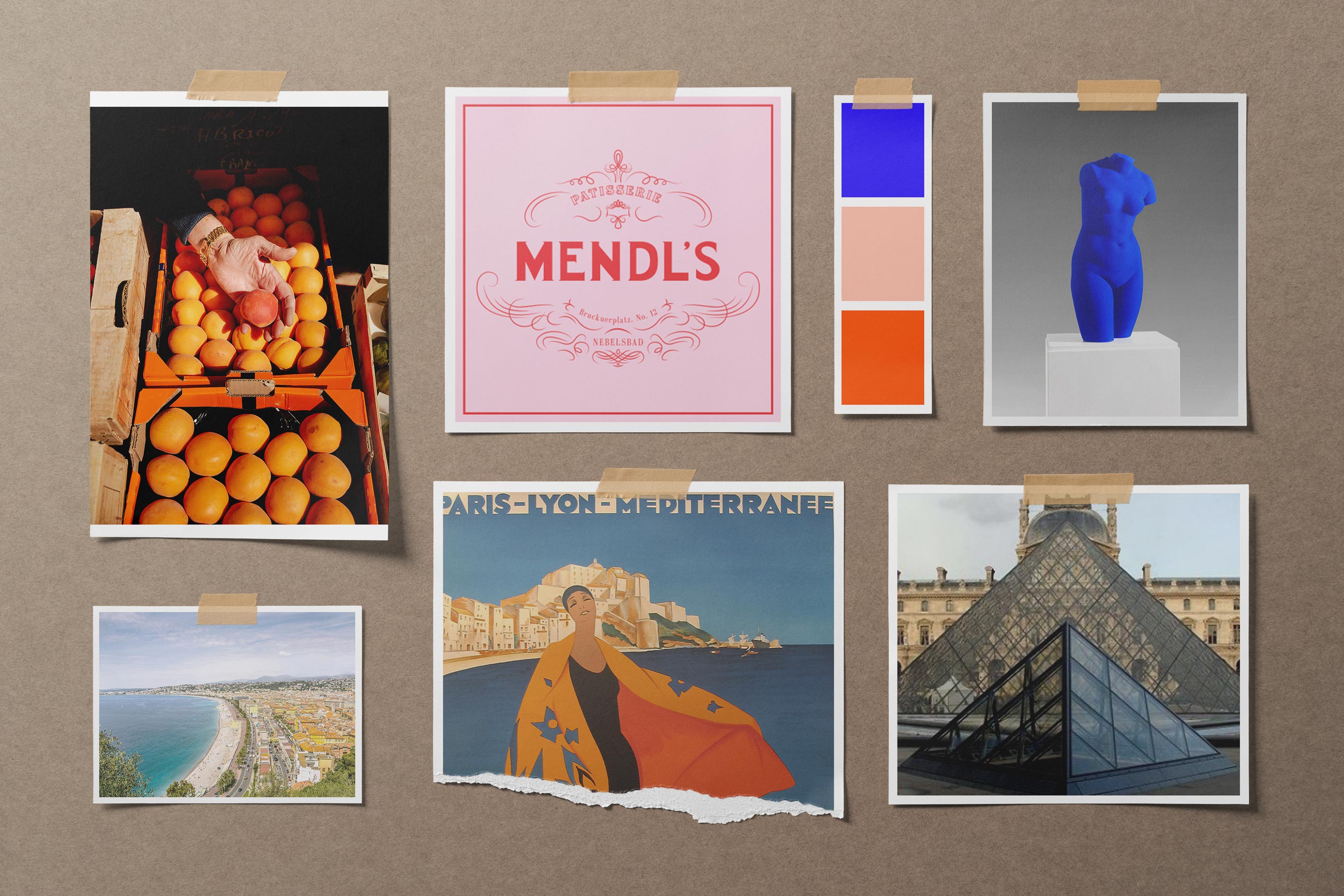
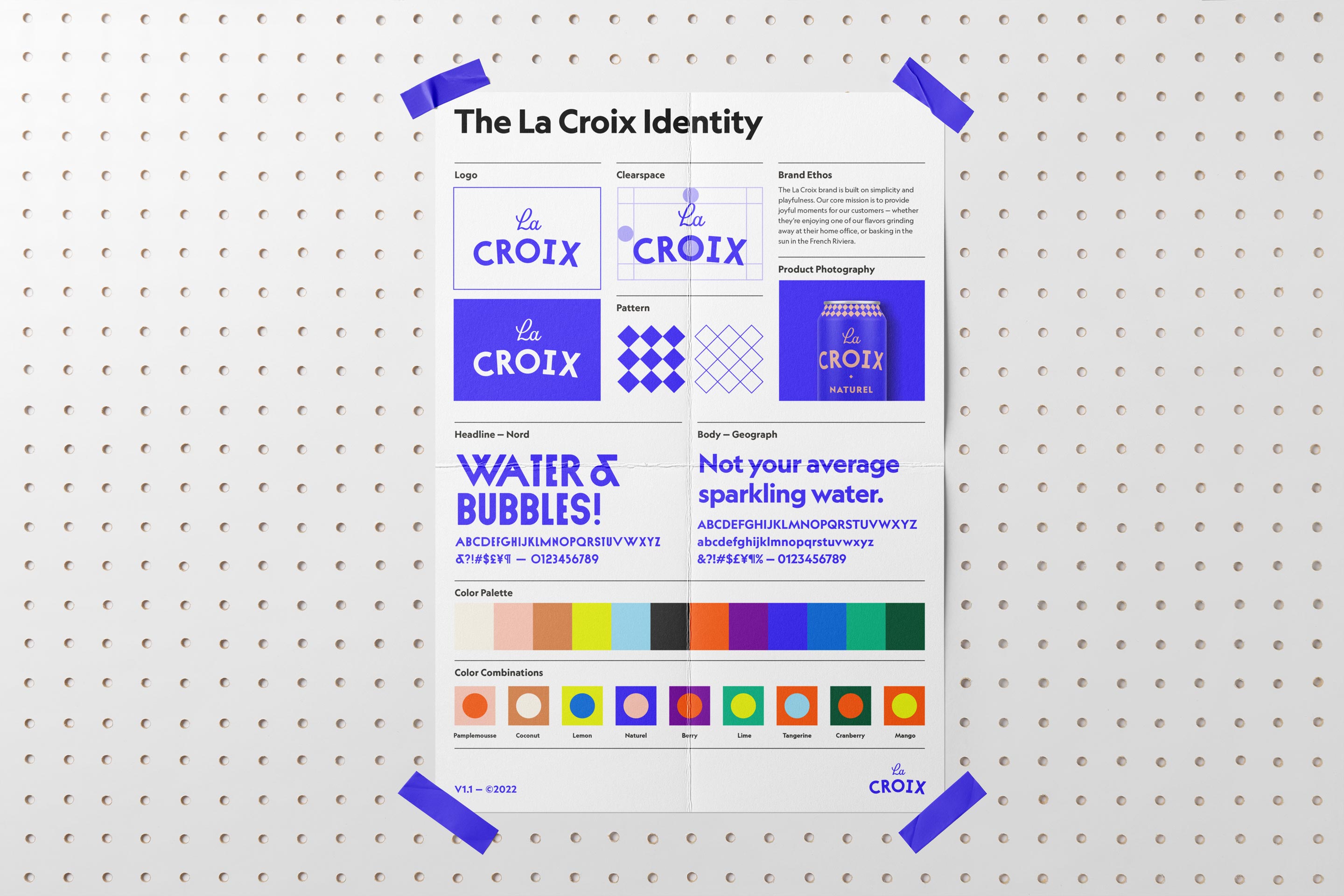
I began looking at vintage French posters and the pointy, geometric typography used in them. One of my favorite artists is Yves Klein, who trademarked his own color of vibrant blue. I wanted to incorporate a similar blue into the ‘pure’ flavor to start. I designed a checked pattern element based on patterns in French fashion and the glass panes at the Louvre to tie everything together.
Let’s Meet the Flavors
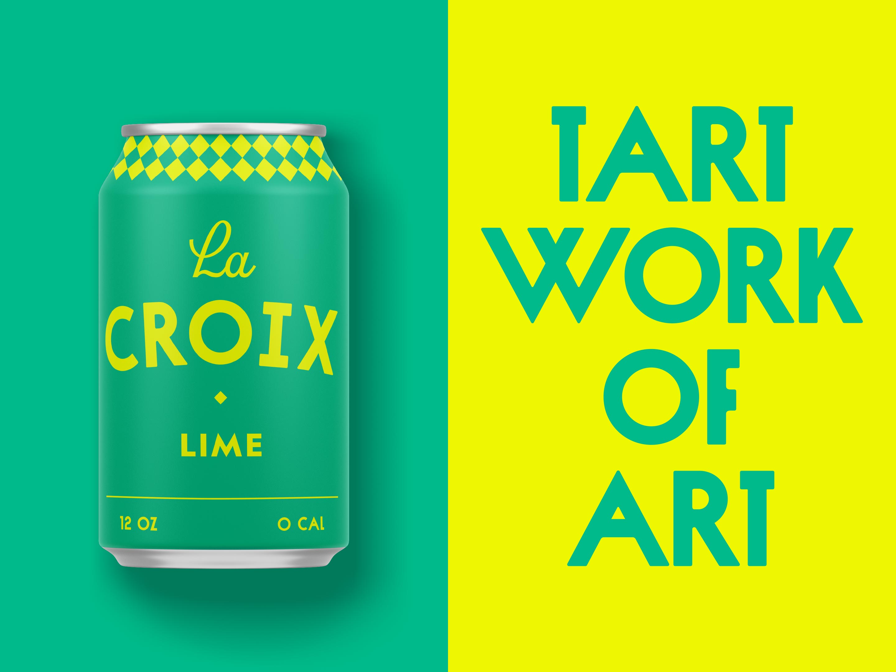
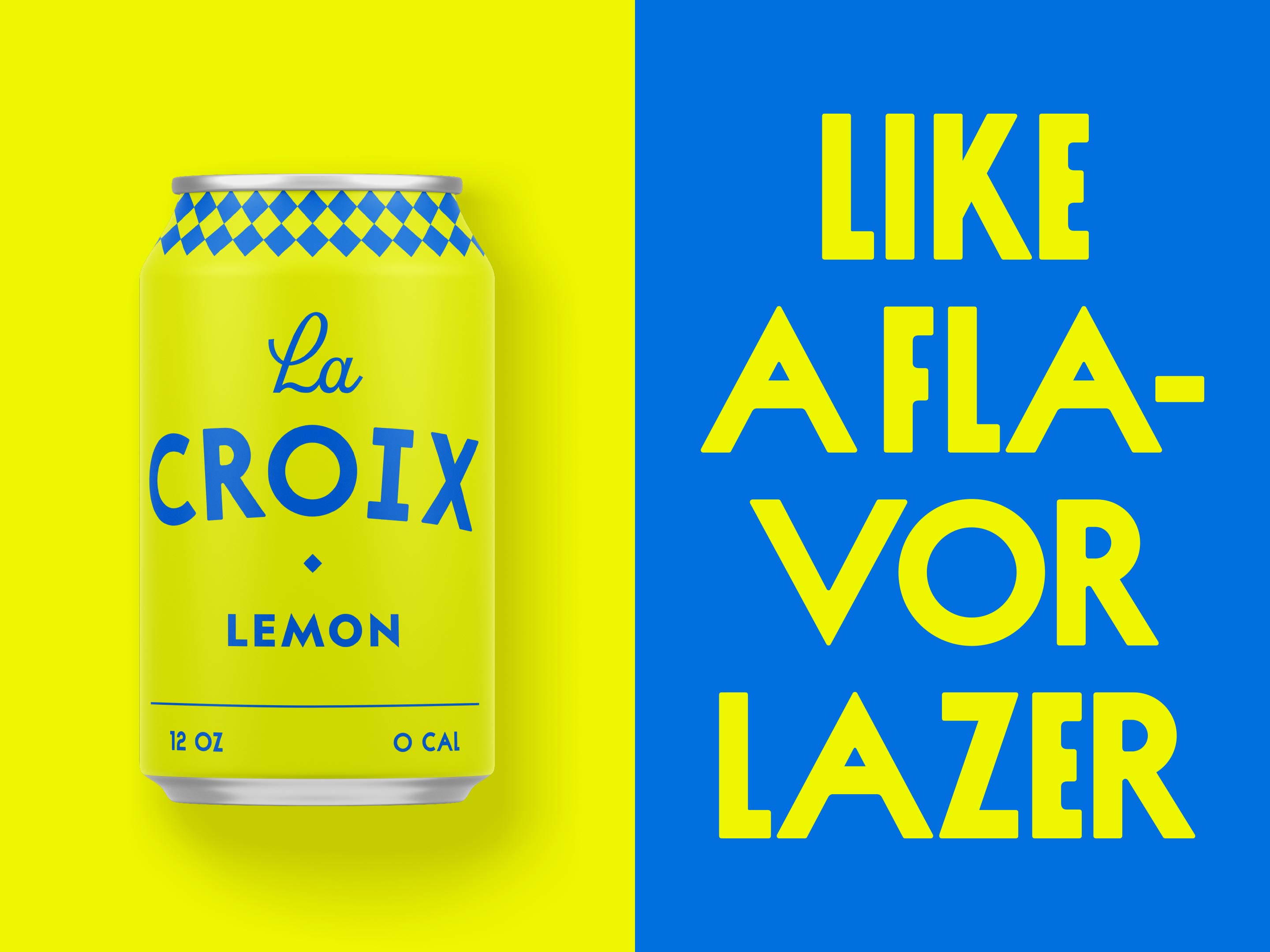
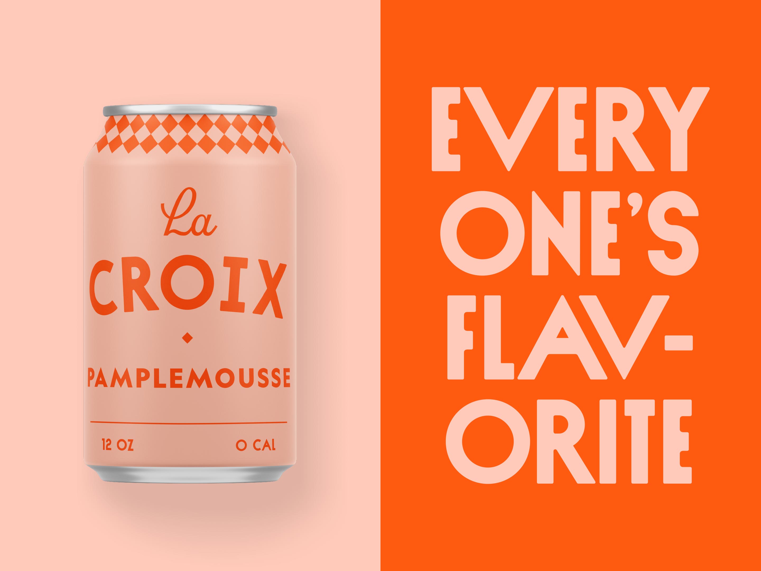
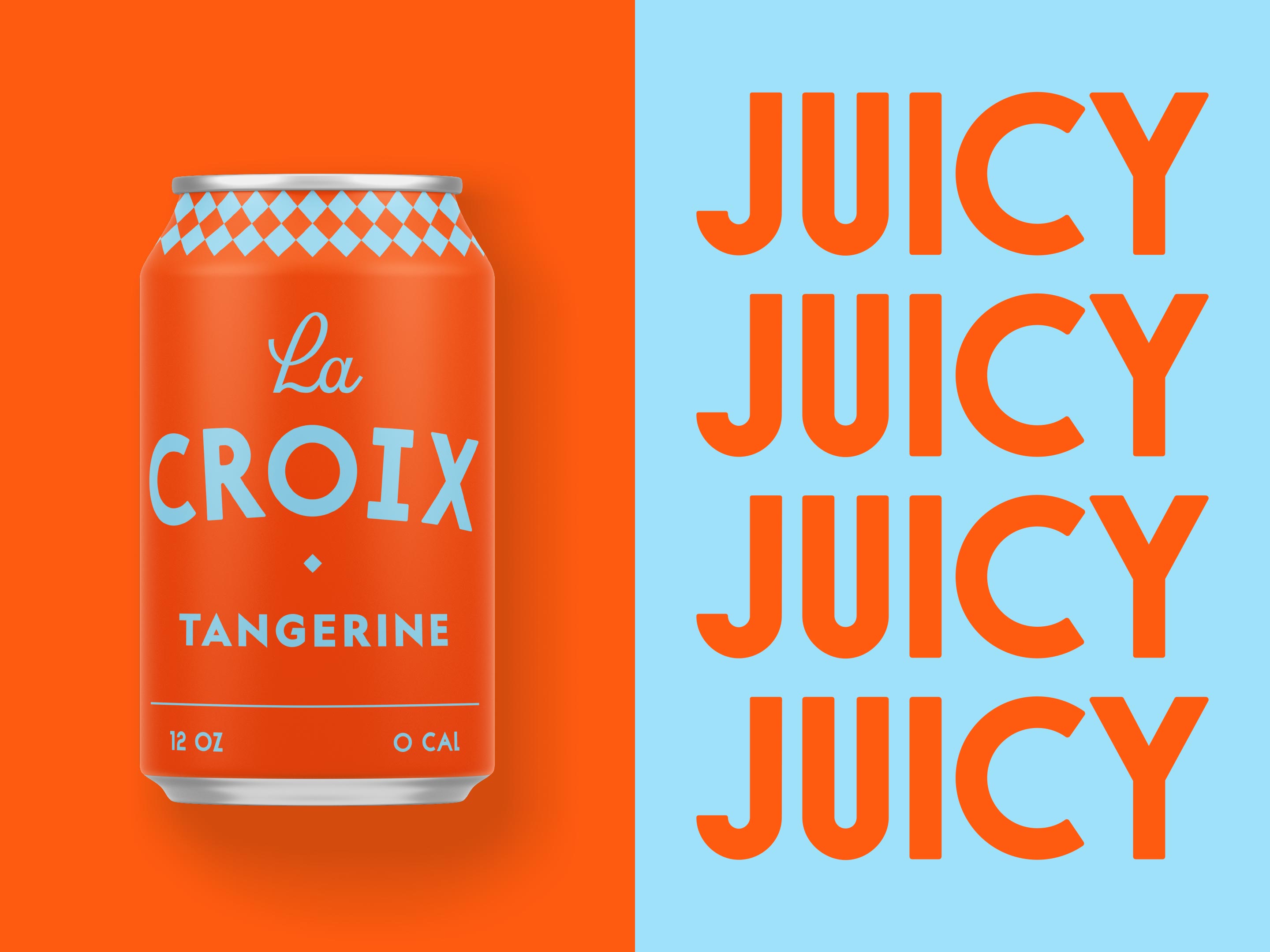
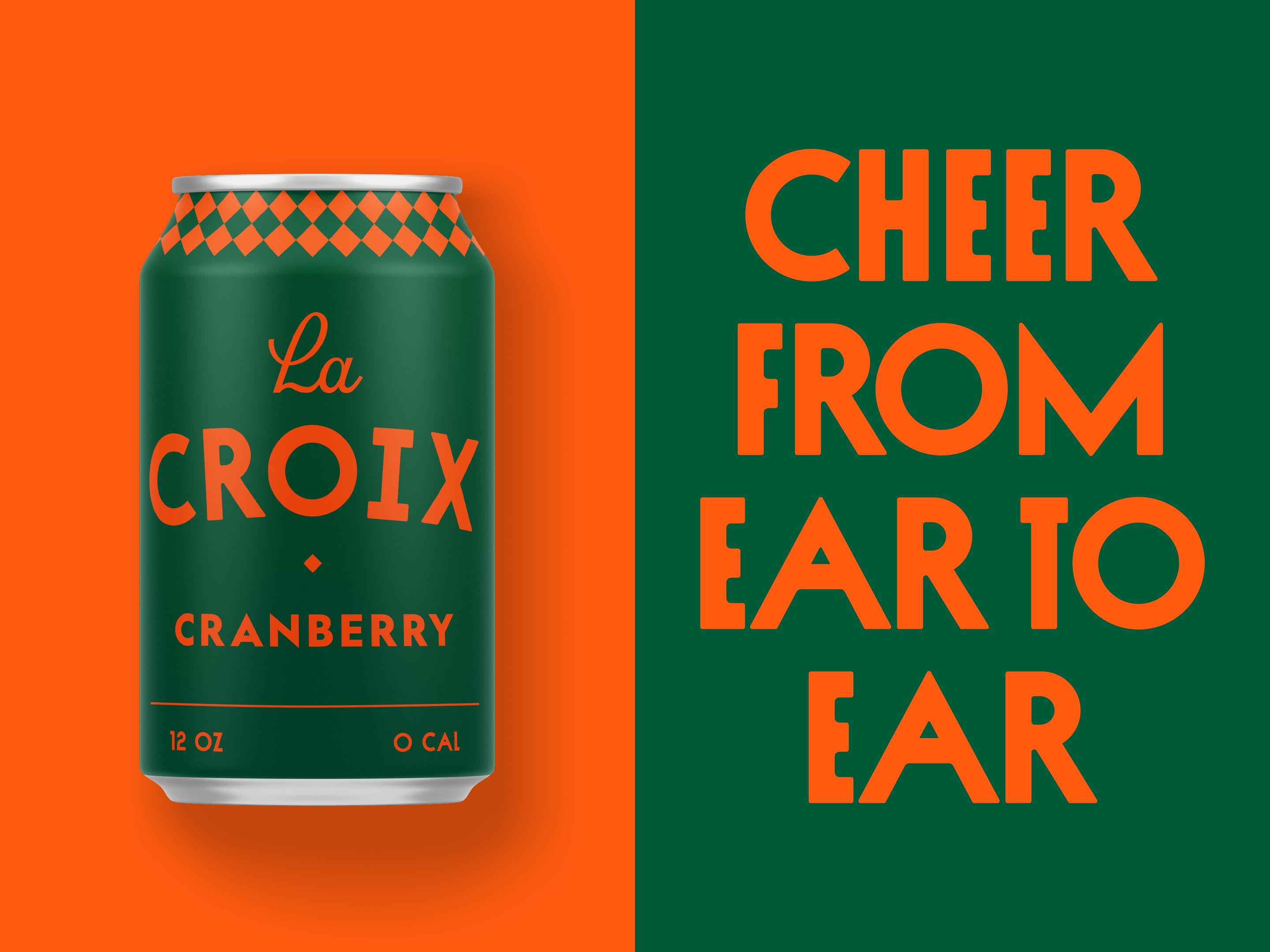
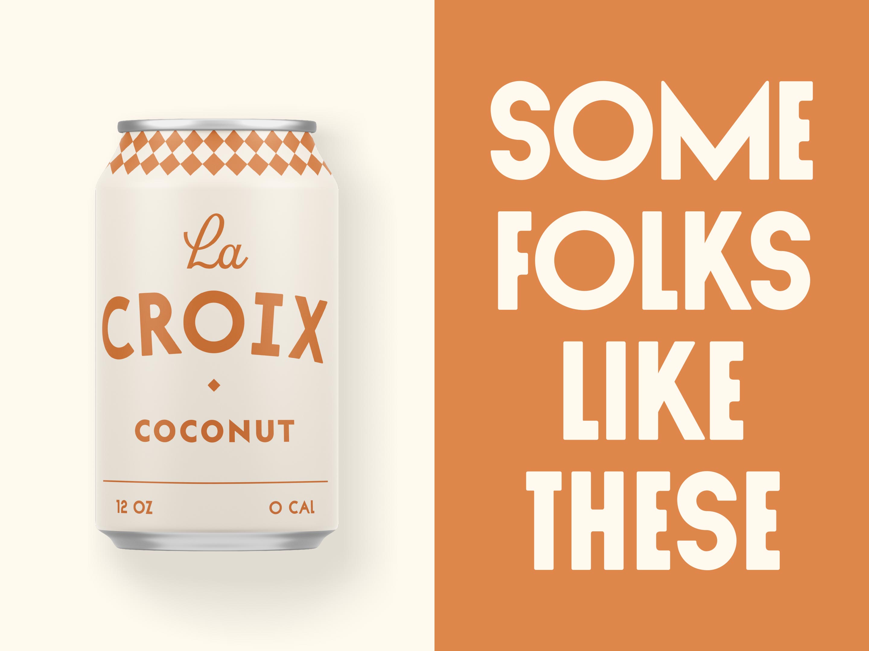
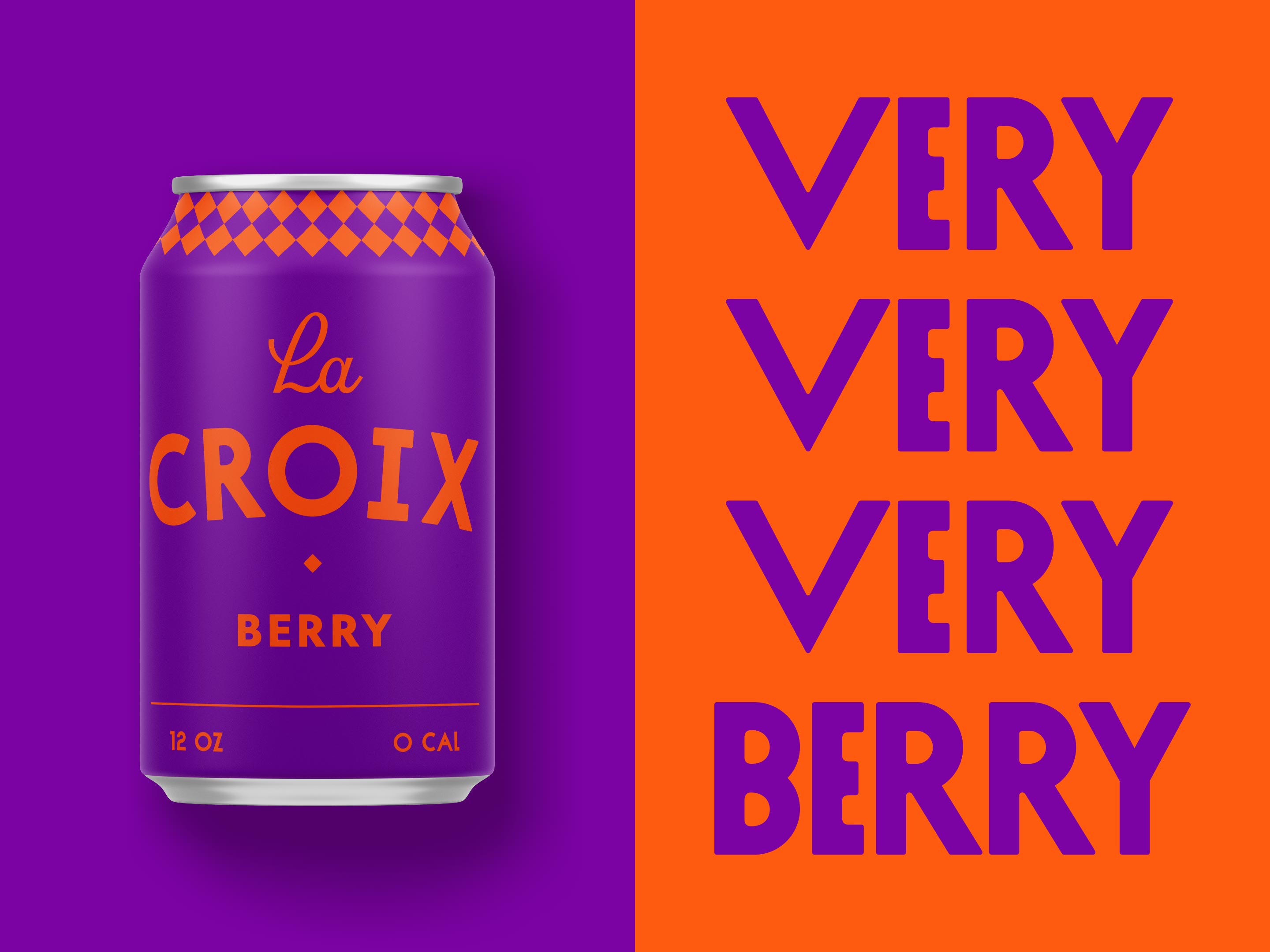
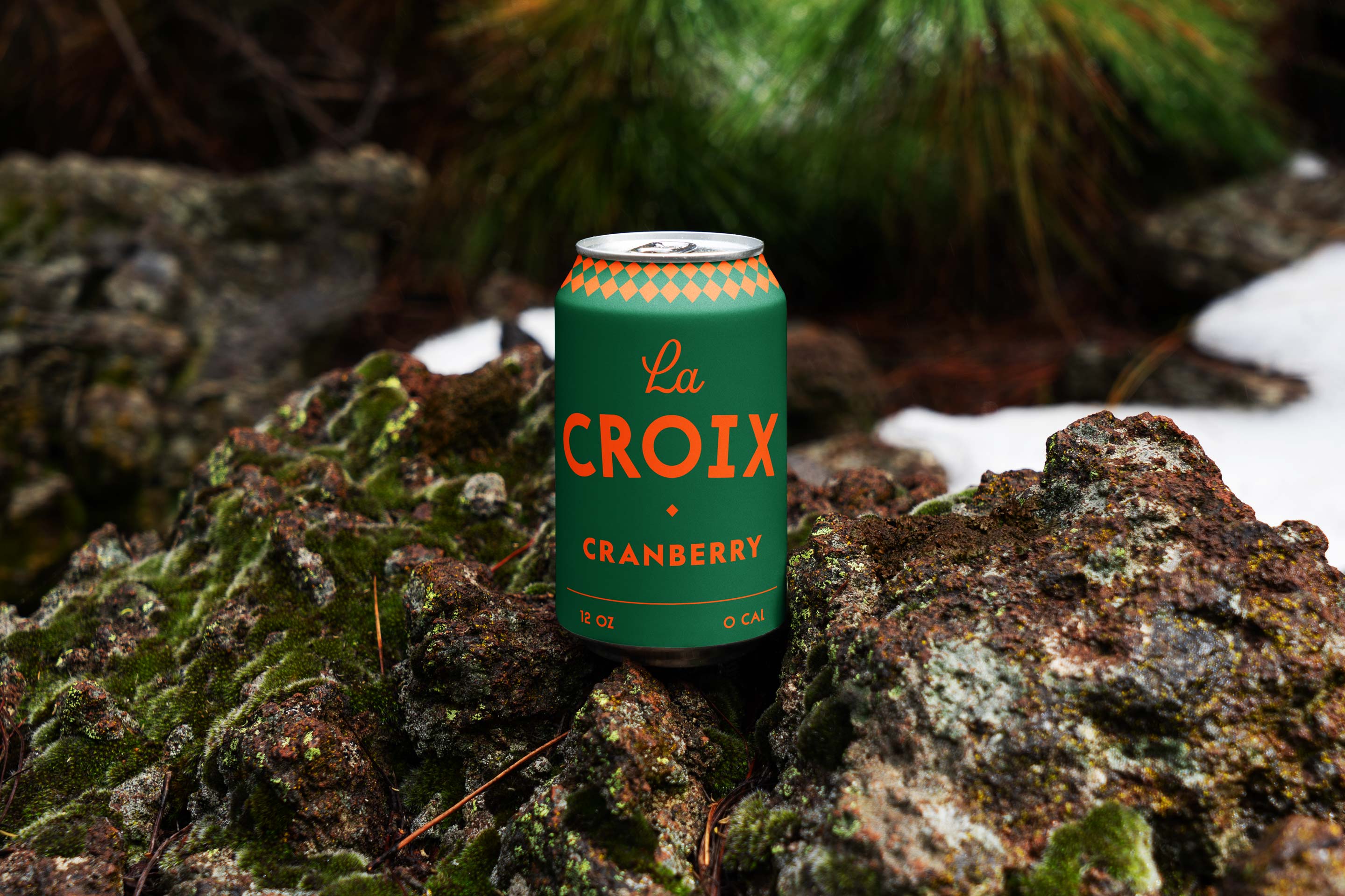
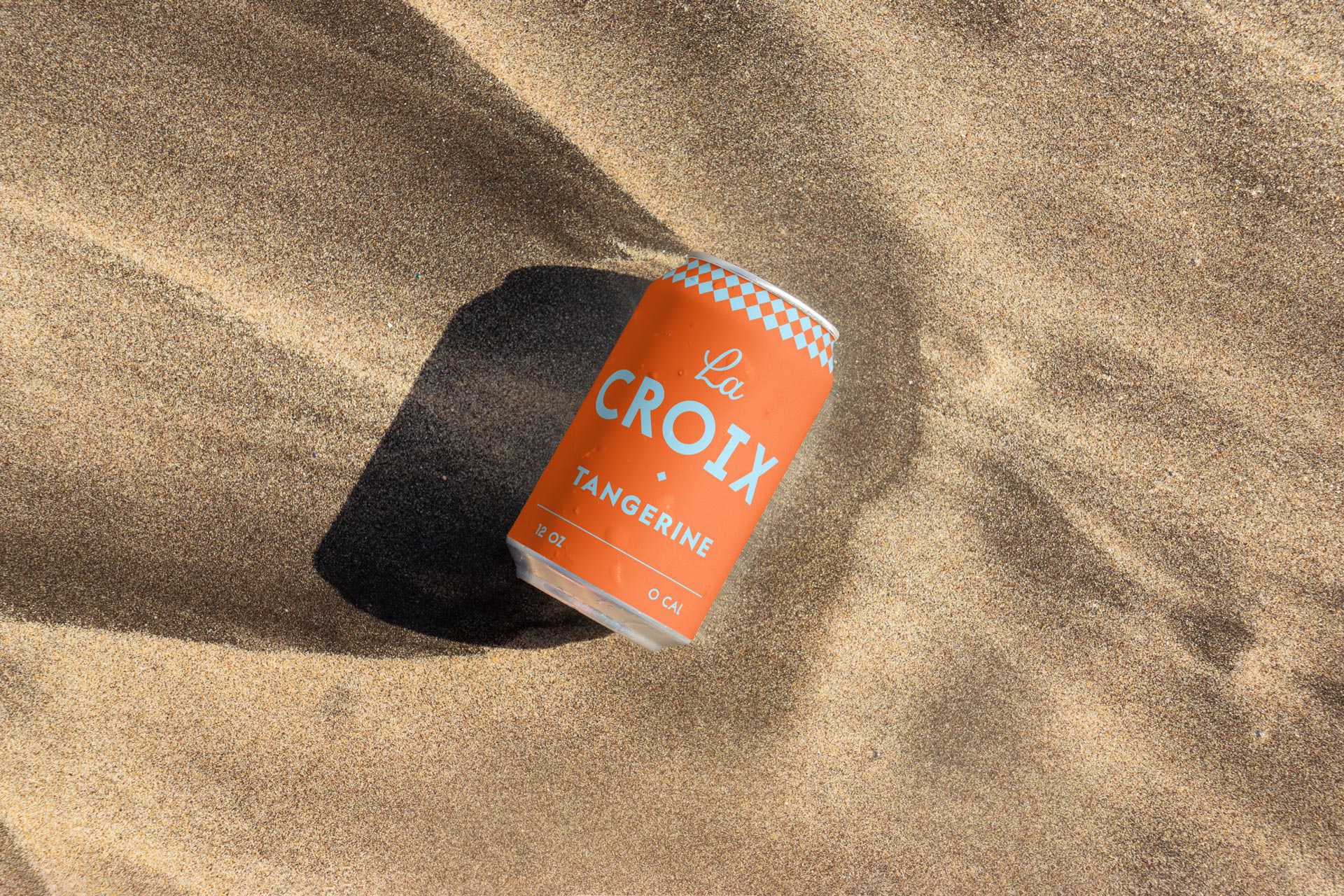
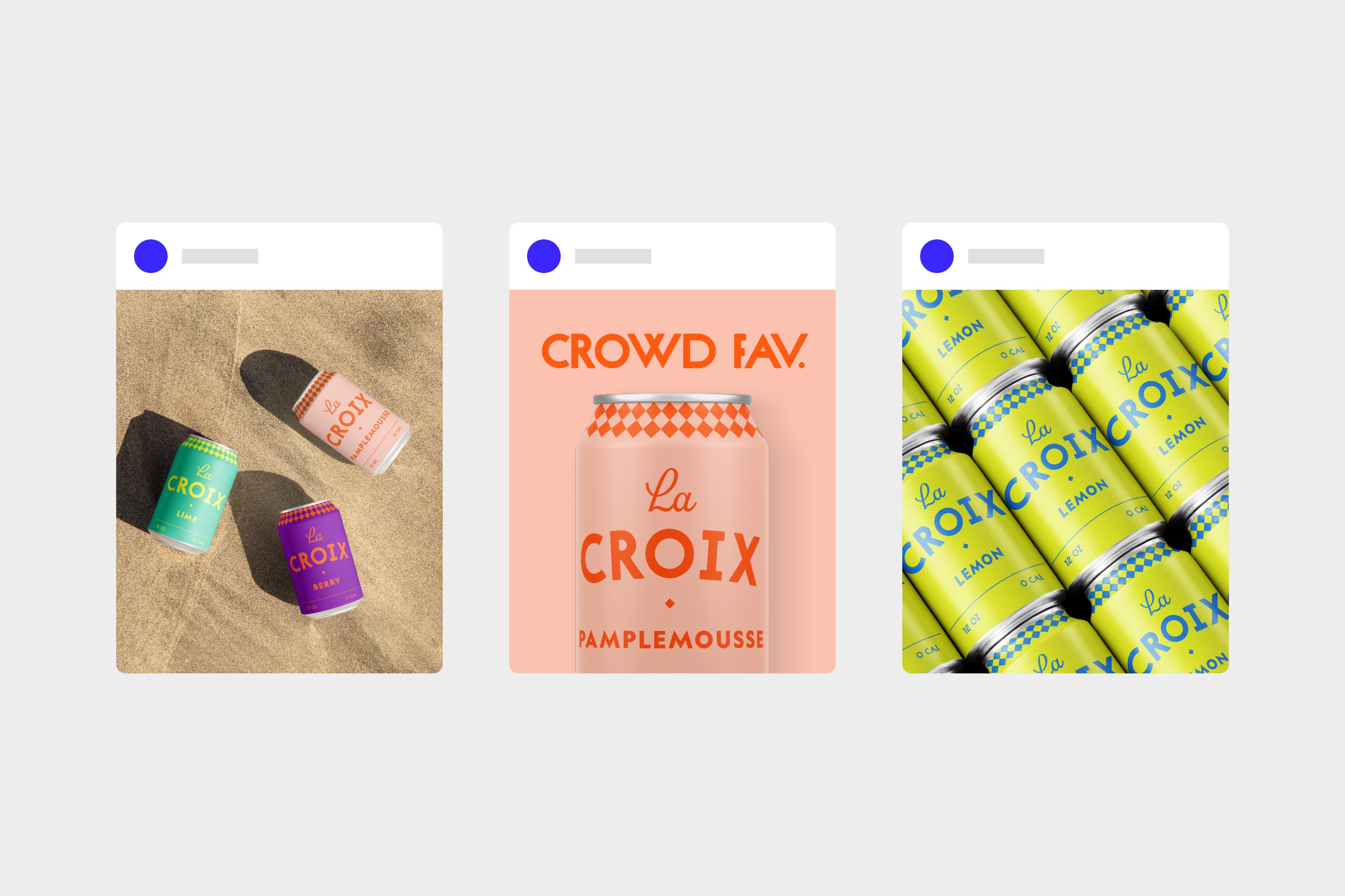
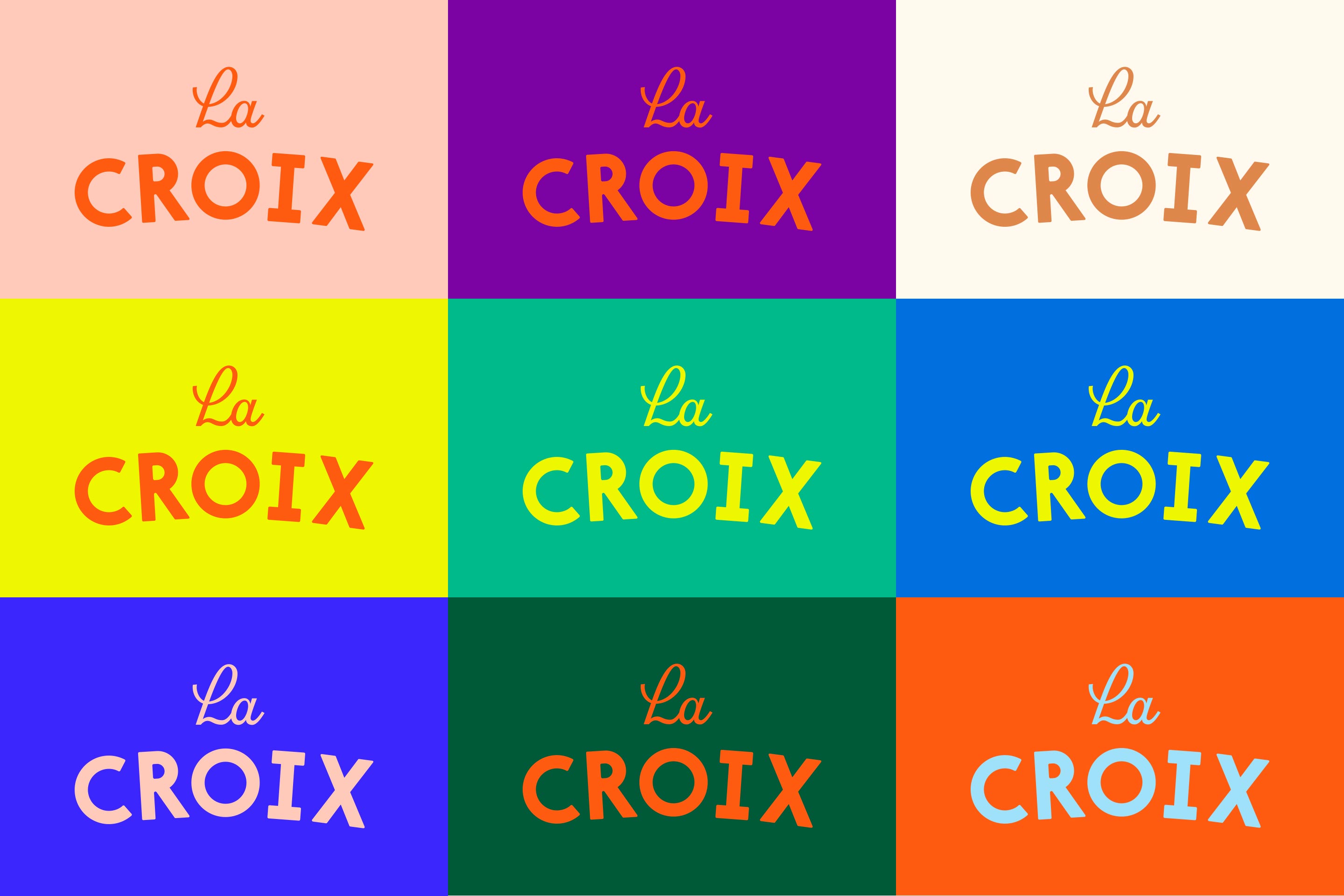
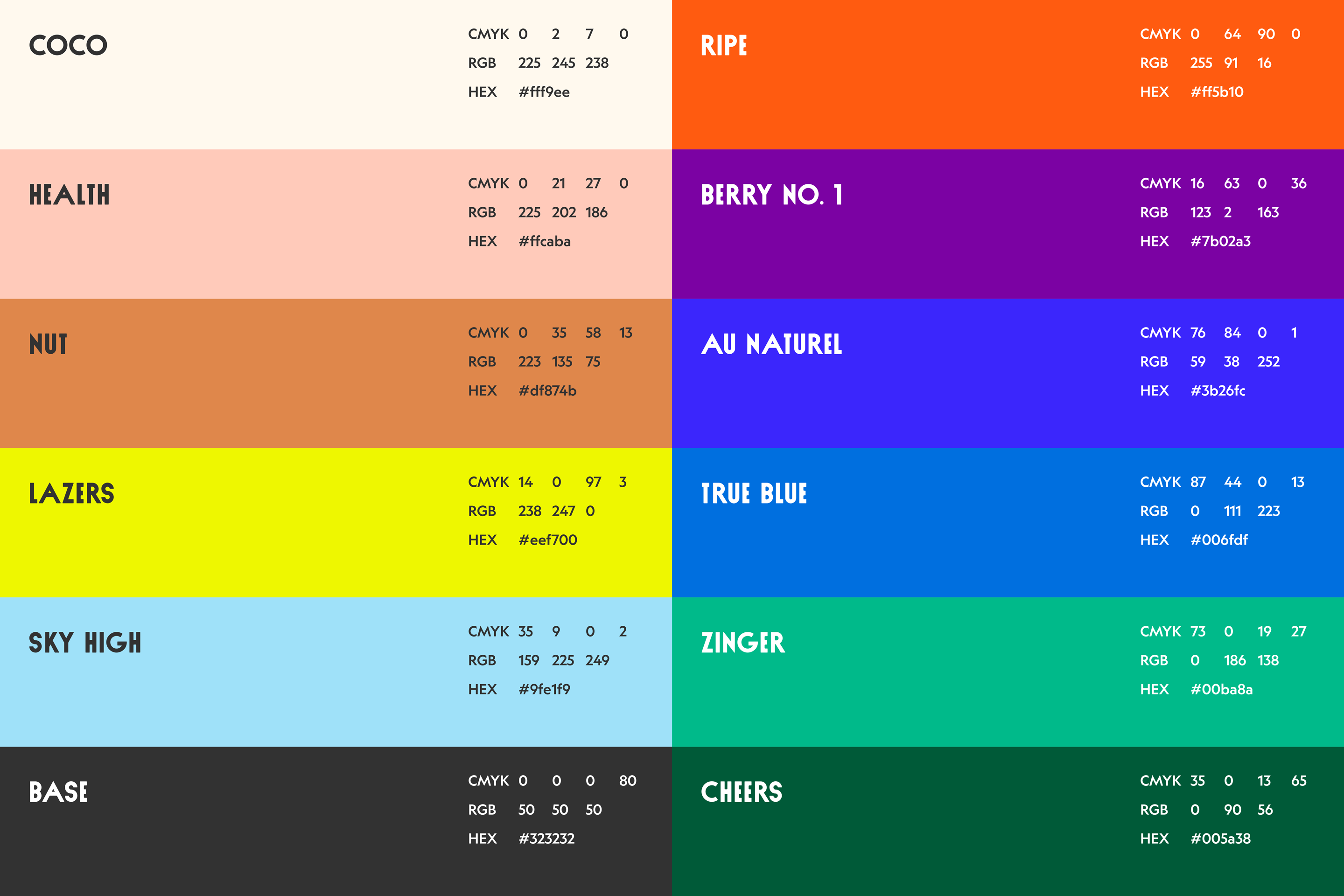
I wanted a lot of flexibility in the color palette, with the combinations being very flavor-forward. Each flavor presented an opportunity for playfulness — I gave each one a sense of individuality while working within a more extensive system. I went with a duotone scheme to keep things simple and used an AI tool called Khroma to develop striking color combinations.
